The Rebranding of Rowe's Print Shop
On this page I will go into detail about the rebranding I did for Rowe's beginning in 2017. This mid-sized print shop, located in central Pennsylvania, was founded in 1959. Despite employing many graphic designers over their 50+ years, Rowe's never established branding guidelines or a consistent branding style. As each lead designer would fulfill their role, they would implement their design preferences as they felt fit. The ownership would give final approval, but not much direction, as they had other pressing concerns.
The Logo
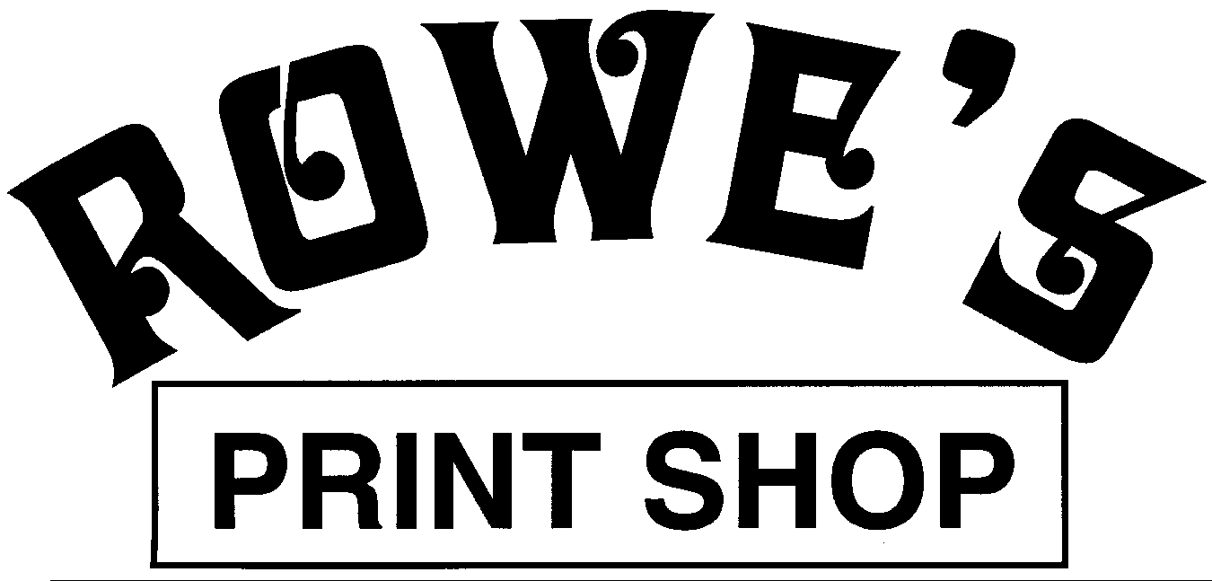
The logo was originally created in the early 1970’s. The decorative typeface of the primary text in the logo is in the style of Art Noveau which was very popular during this era. More text and elements were added at some point in the late 1990’s, once the company became incorporated (such as the boxed type).
The color scheme for the logo was originally a maroon logomark against a golden-yellow background. In the early nineties, the lead designer for the company began incorporating more modern graphics and color schemes for their first (re)branding.
The Challenge
I feel that when a company has a long history, a consistent logomark is invaluable. Whether it is good or bad, you can’t replace recognition and ubiquity. I did not want to reinvent the wheel. I defintitely felt, however, that the branding was very dated.
My idea was to modernize the look and feel of the branding without changing the logo drastically. Throughout the history of graphic designers employed by Rowe’s, many were self taught, apprenticed or had some schooling. None were graduates of a four year program. Minute details are either missing or not well thought out in the early branding. The kerning of the letters in “Rowe’s” were the first thing that lept out crying for attention when I first was hired by the company. The word is on an arch that is unbalanced and probably created by hand. The letter forms have solid, flat terminals that are unforgiving on an uneven arch. My first goal was to rectify this portion of the logo. The apostrophe and the descender in the leg of the “R” were significant challenges. I would not have chosen this typeface for arching based on it’s qualities but, again, I did not want to change the image that people have grown to recognize. I would adjust the kerning as I saw best and readjust the arching principle to be visually aligned better.
I did not like the idea of a black or white logo as the primary logo, either. They would definitely serve their purposes, but I want a primary logo that could have some pizazz while standing alone, apart from secondary graphic and imagery. There were several instances in the existing packaging where the logo did not have enough contrast or was overwhelmed by the surrounding ephemera.
My concept for the rebranding was to update history. I wanted to retain the printshop’s longstanding visual relationship with the community. I was also adamant about the logo not being married to an era. I hope that 10-20 years from now, my replacement would not have similiar criticisms of my efforts. The logo would also have to be flexible in terms of contrast to be utilized in the myriad of ways that the company used it.
Colorful was another idea that I wanted to retain. I liked the idea of emphasizing the beautiful spectrum of printed products. Conceptually, I had mulled over the idea of using a CMYK color scheme. I decided that this was too common amongst printers. Also, the colors just don’t look good next to each other. Sure they had a practical place in the printing process, but that does not translate into a beautiful brand.
First Logo Idea
The Decision
I wanted to avoid the logo being too flat and commercial. These might be trends of this time that trap the brand in an age. Also, this was still a small family business, so something corporate and minimal would not fit the brand’s personality.
My plan was to keep the logomark shape the same with some major tweaking. This would serve to retain the familiarity. This would also keep the family from having to spends tons of money replacing it’s exisiting signage and packaging which is a major consideration.
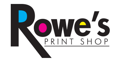
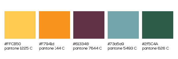
I then chose to incorporate the “rainbow” of colors into the logo itself. I created a five color system to display this concept. The maroon and golden-yellow that still exists in some of the older signs and merchandise would be my base. I also included a yellow, a light cyan and a forest green to give me a palette with a full range fo values. These colors would blend together to make my new rainbow. Because the colors would range within the logo element from light to dark, I decided to encapsulate the logo in a surrounding stroke that would define it from it’s background. In single color uses the logo would be simplified and not contain the stroke information.
There was a pronounced “weave” pattern that was often used as a background in the previous branding. This texture had a great range in value which I found to be very busy and distracting. I chose a subtle grid that reinforced the printing concepts. This new texture was a medium grey with a lighter grey gridline pattern and just a touch of spontaneous texture roughening so as not to be too formulaic. I sourced “inflicted” from subtlepatterns.com by Hugo Loning. The texture has subtle bits of random noise that keep it from appearing too formulaic. The grid lines replicate those used by those in the print industry for registration and design. I wanted to tone down the contrast in the pattern so it wouldn’t be too busy on the screen. I darkened the grey as well to add some additional contrast for the bright colors.
The final Logo
The Website
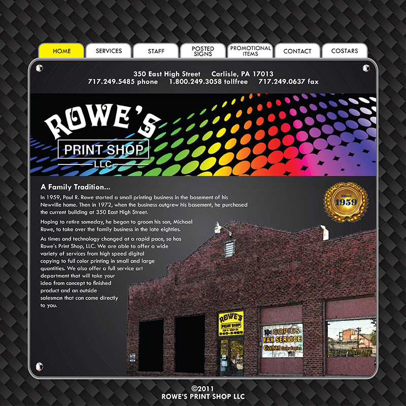
The company’s website was first created in 2008, although stylistically it could've passed for mid-1990's. I first began learning how to write mark-up in 2011. My newfound love for web design, coupled with my opinion on the outdated site, is what initially sparked the voluntary rebranding effort. The website was table-based and non-responsive at different screen sizes. I knew I could make an immediate impact on the appearance and usability of the site. I have always been taught that a website is possible a company’s greatest asset. It is often a customer’s first impression of a business. The “curb appeal” of the site can have great influence on a client.
Having considered the issues with the exisiting graphic identity of the company, it was at this point that I decided that we should start everything fresh. I would like to employ a defined color sheme. I would like to establish primary and secondary typefaces. I would still maintain pattern work for texture and filler, but would like something much more subdued and meaningful.
The logo shape was corrected and refined, and I now had assets to implement in the designing of the site. The first step is to define the site map and start to plan on organizing and placing content. I would study the existing site to see what worked and what could be improved upon. Of course, I would have to rebuild the whole site structure on the back-end, so I was careful to copy all the files and take many screenshots to document the sites behavior and structure.
The Plan
Now that I had a visual plan for the site, I would begin formulating the content and structure. I would want at least two different navigations for products vs. information. The product nav would have our offerings and services as well as portals to order signs, and the information area would have content about the company and contact info. I decided that descibing who we are is the first priority for new traffic. Contacting us would be the most important feature for returning users. These would be grouped together at the top of the screen for immediate access. I would have a side menu on the left that would detail our products and services. I then began to lay out how many pages I would need to list. Since there was a side menu, I chose not to have a fixed top nav that I usually incorporate in my sites. I did not want there to be overlap between the menus. I decided that there would need to be a footer that would repeat the top links for accesibility. I did not foresee the pages being very long, in favor of more direct and specific pages. The single page parralax sites are very popular now but I do not think they would work with a site with many destination links. I also wanted there to be fixed methods of contact. We were in the process of building an email list for marketing, so that should be prominent. And of course, we are a business, so eliciting new business should always be a priority. An immediate contact/quote box would also need to be prevalent. I did not want to have tons of annoying pop-up boxes, so I decided on a fixed right panel that would contain theses elements as well as some other pertinent information like hours of operation and links to our social media.
I began to construct a grey box model to see how the architecture of the site would lay out.
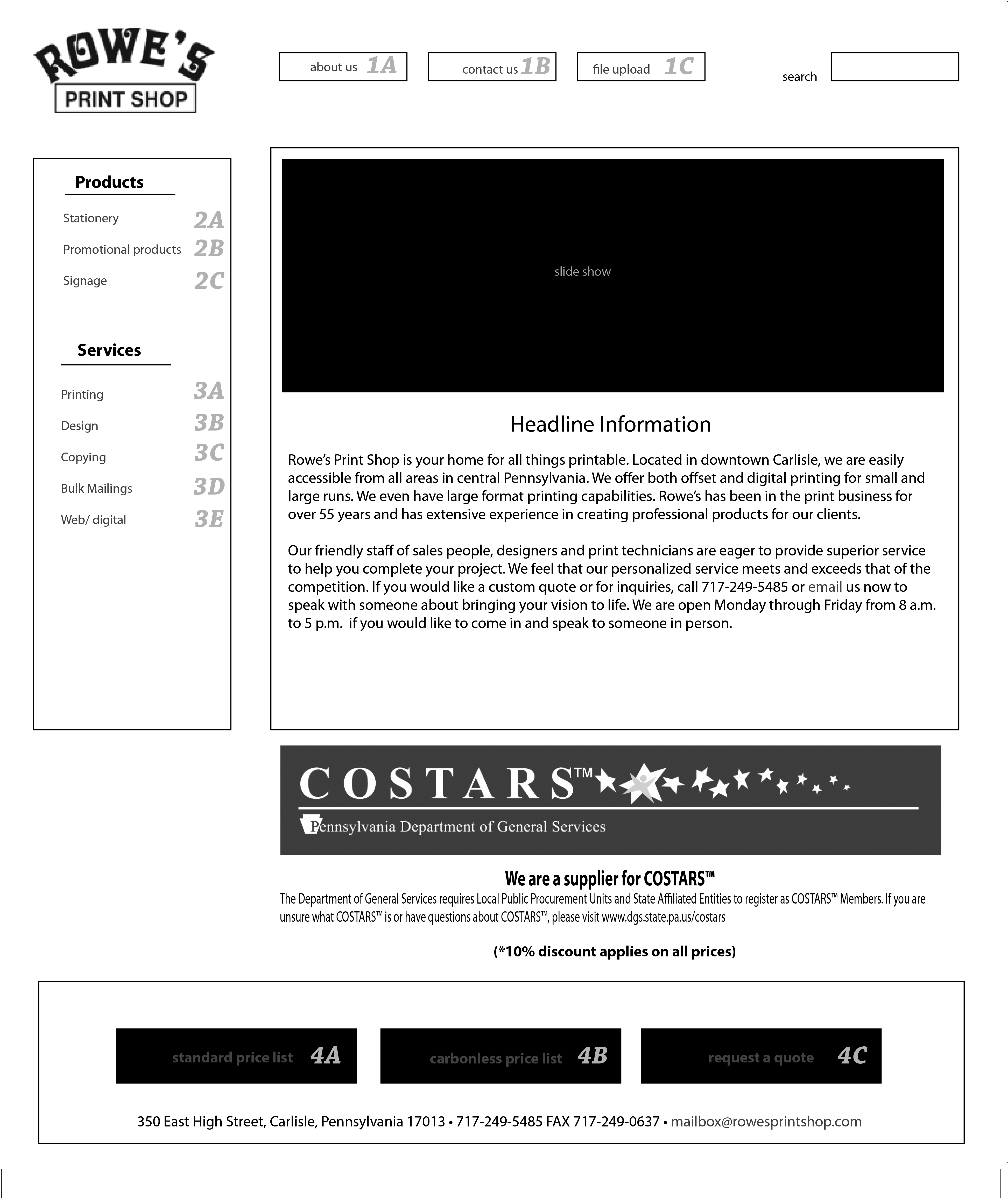
This is the original outline for the homepage to show to my boss.
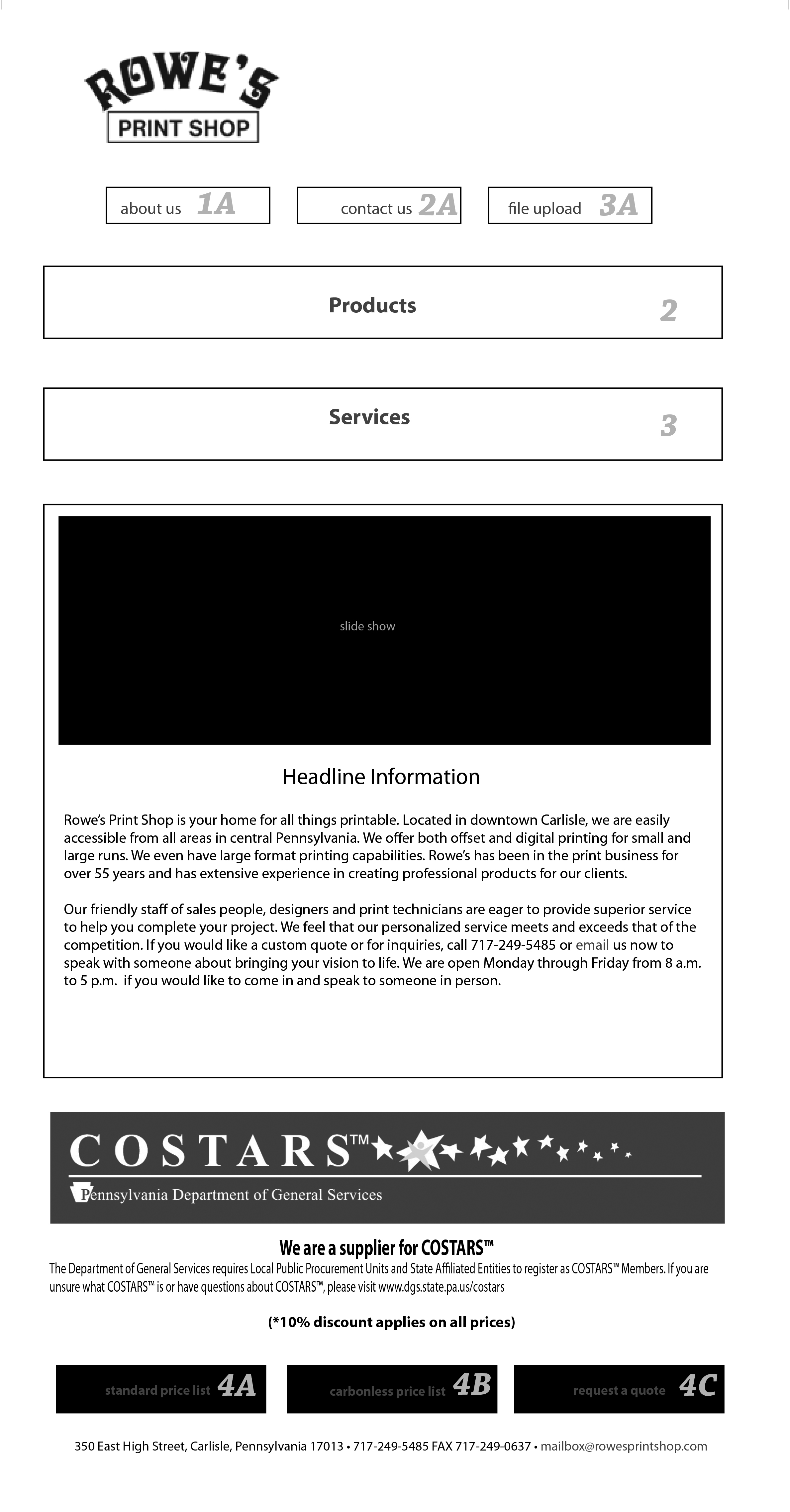
I would also plan for mobile screens at every stop along the way.
On the left was my initial outline for the homepage on a regular screen ration 16:9. The outline is for the full length of the page, I anticipated the “fold” to occur right below the slideshow. On the right is the mobile outline, I always start with these two sizes and then code an additional tablet size to be a middle-ground for these two. The mobile system will not allow for suitable sidebars being that it has a narrow screen aspect.
I planned on reordering the navigation. I determined that the services and products menus would be used much less on mobile. Typically, mobile usage would be for contacting or curious explorers, not for actual business transactions. Those menus could be collapsible to save space.
I also had not decided at this point how to handle my immediate quote, email sign-up and social media. I was still considering using pop-ups for the first two items and possibly having the social icons in the top nav. At the present, the company was only utilizing facebook, so other icons would not be necessary. I began to flesh out the other pages to see how spacing and content would lay out. It seemed that all of the pages would have a similar amount of information so the central block could start to be developed further. I chose to have a H1 title and graphic on each page to remind the user where they were, because I did not envision "active" states for my links to be effective with this layout. Incorporating custom graphics on each page would be a great opportunity to highlight our graphic design capabilities. This website was also going to be an example of a product we sell, so I did not want to take any shortcuts. I would need to incorporate a grid structure within that central div to accomodate the pages that would display products and the staff photos for the ‘about” page.
There were some trends that I would want to incorporate into the site to demonstrate that we are current with technology. The site will be fully responsive. The site will incorporate motion, without being too flashy. Buttons will be interactive with hover effects. Javascript based slideshows and carousels will be featured. Php would be used to create instant contact forms for estimates and questions. Another huge addition will be the ability to upload files to our server through an FTP page. This page will be located at the top nav for easy access.
Here is a link to the current site.
Printed Materials
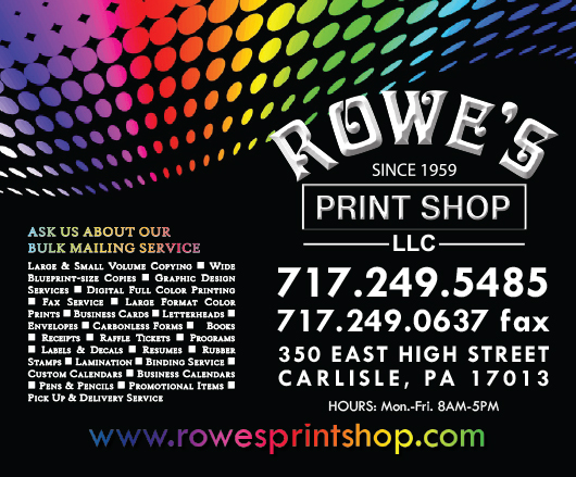
The trouble with Rainbows
This is the design for the wrap that covered the hood of the delivery van
This is the design for the van doors.
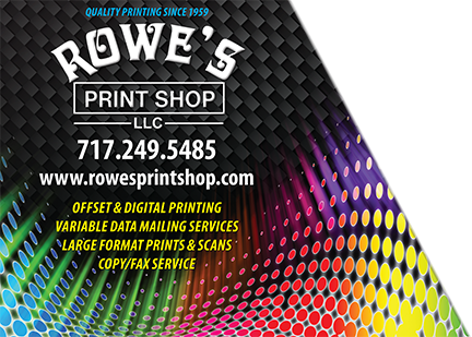
The company has utilized their previous branding well. They have vehicle wraps for their delivery vans. There are large window graphics. All of their products go out with branded labels. The example on the left is the hood graphic for one of the vans. Here you can see the use of a sourced rainbow graphic that is prevalent amongst their branding. This very striking colorful image forced the company to use a white or black logo to have contrast against the background.
I think there were some unintended connotations that came with the combination of the organic, flourished type and the almost tie-dyed rainbow coloring. To me it reads "hippie" which couldn't be further from the truth. The raised shadowing on the white logo that gives an appearance of depth also seemed arbitrary to me. In terms of visual logic there is different light sources for the type shadowing and the light emitting from the undulating color dots.
I also noticed how difficult it was to incorporate other text in this graphic scheme. The lower image was used on the doors of the van. Here you can see the weaved pattern that I discussed earlier. The designer placed the important text above this darker background for contrast.
Labels, etc.
At larger sizes, like the vehicle wraps, the scheme was not terribly unsuccessful. It was in smaller examples that I personally struggled with finding a balance between legibility and visual interest. The product labels were intended to inform the customer of the company’s capabilities. They actually conveyed a great deal of information such as the hours of business, avenues of contact, location and more.
This is the 2007 box label.
This is the 2017 box label.
Here are two previous label designs from 2007 and one I worked briefly on in 2017. There are several typefaces used in the first label. There is a nice hierarchy to the information. In this instance, the designer wisely chose to forego the weave pattern in favor of a simple flat black. The sourced stock graphic is much more understated in this piece.
Above is another example of an older piece from before the rainbow aethetic was decided upon. These also show the logo before the LLC was formed. There was no consistent color scheme and the different designers created labels and ads based on their personal preferences.
The New Labels
Uniformity and consistency were key factors in my attempt at rebranding. I wanted a visual architecture that would work in any environment. I had already established a color scheme and had some assets that I created when building the website, so I would use that as my style template.
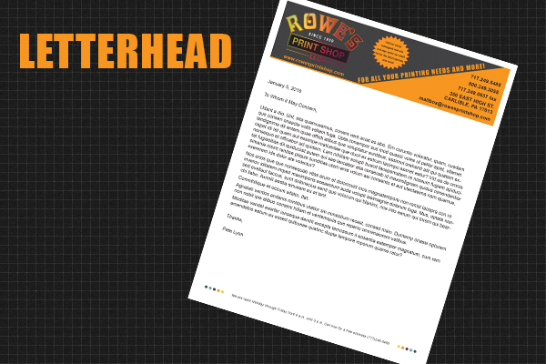
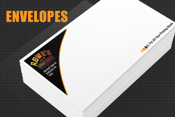
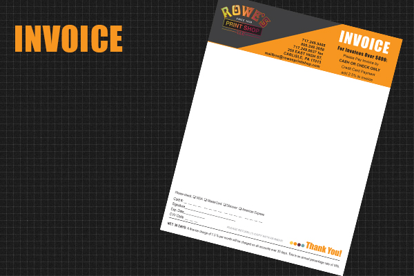
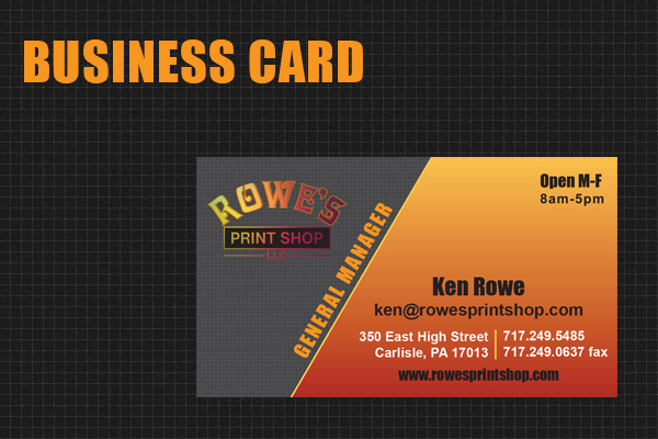
Stationery
These pieces were created to look beautiful alongside one another. There is a nice balance of light and dark between accompanying items. The Arial and Impact typefaces are very clean and legible. These would be printed on the offset presses due to the volume and cost, so I wanted to minimize the use of black and be mindful of trapping between the Pantone colors.
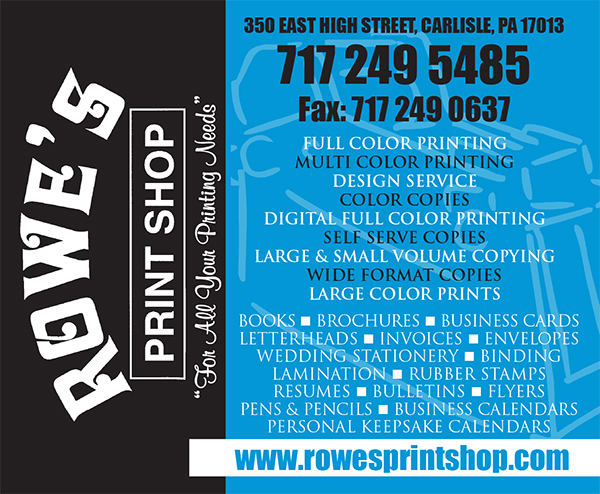
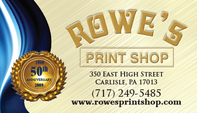
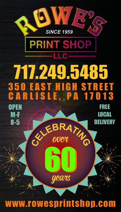
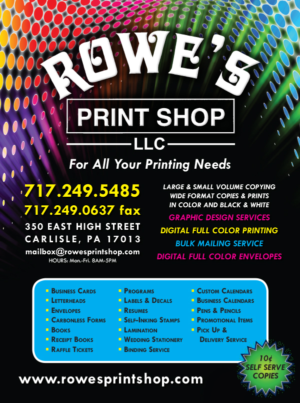
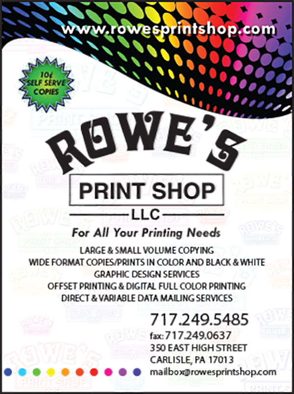
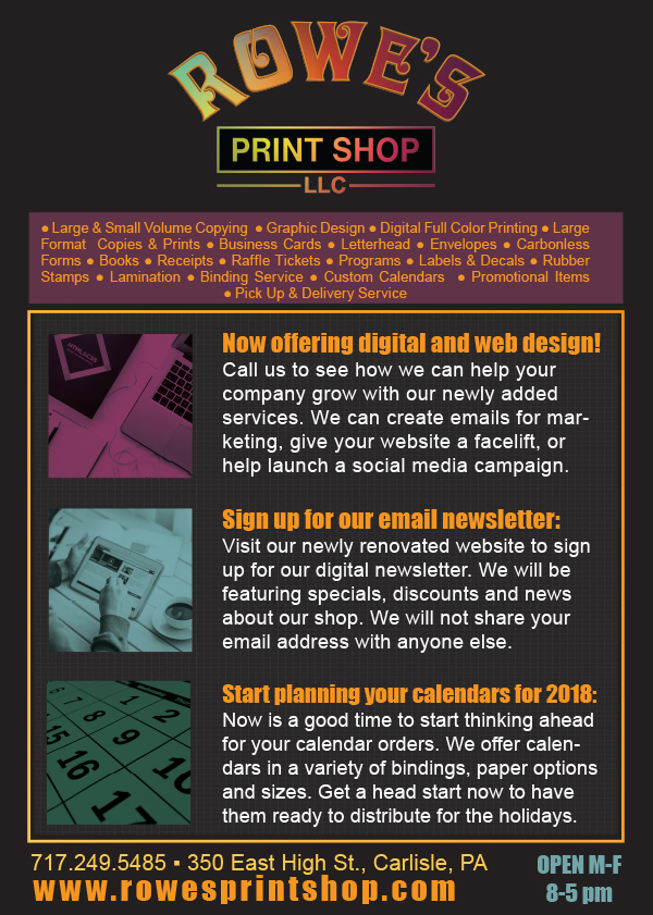
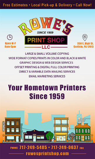
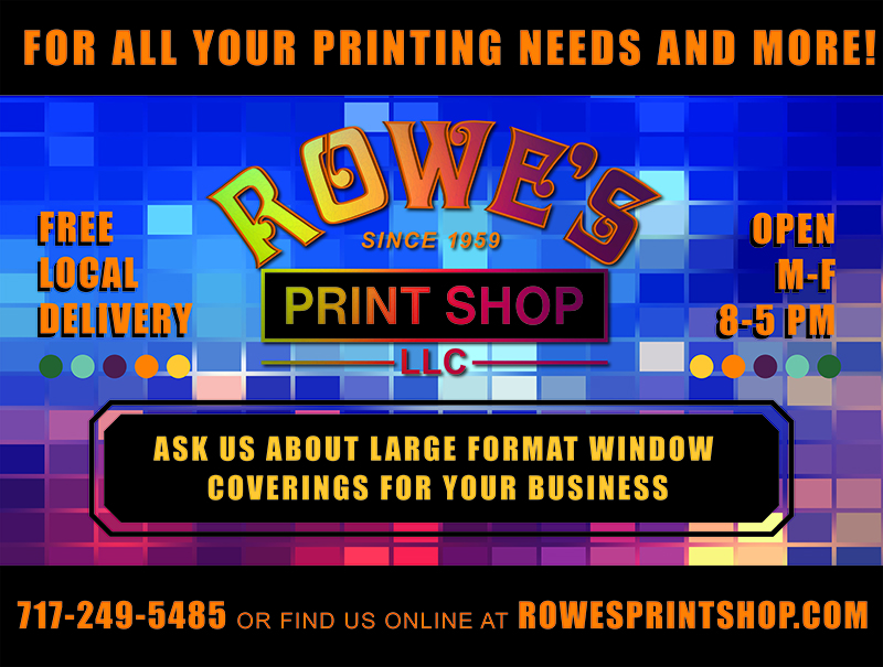
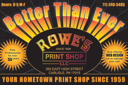
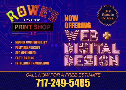
Advertising and Marketing
In this section we will explore different advertising strategies an systems implemented by the previous designer and myself.
Before
After
Window Graphic
Postcard
Conclusion
I hope you have found this detailed look into the rebranding of Rowe's Print Shop insightful. My process in reworking and existing brand begins by analyzing how things can be improved and concentrating on the strengths. I pick pieces apart in order to understand what makes them tick. Once I have clearly delineated any issues and areas of opportunity, the more enjoyable strategy sesssion begins. This project began in my "down time" during the year of 2017 and finished in 2018.