Domestic Restaurant Branding and Identity
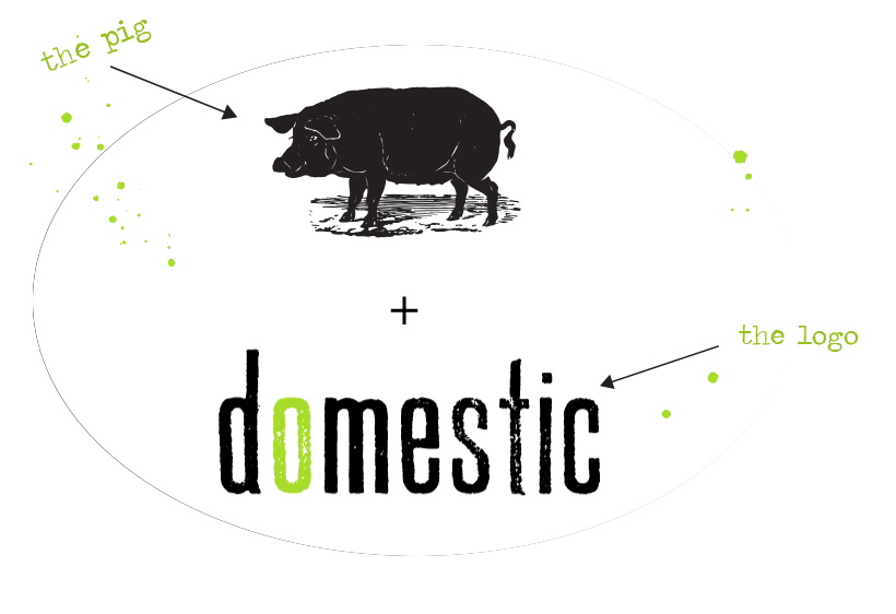
The logo was designed by Eden Design Co., as was the pig icon.
I bartended my way through college in Shepherdstown, West Virginia at this restaurant when it first opened. Domestic was the first "farm to table" restaurant in our area. The owner, Doug Vaira, was very supportive of my new path and let me take over the design work shortly not long after opening. I spoke with Doug to try to understand the concept of his restaurant, in his terms. He spoke of making dishes that would evoke a sense of nostalgia, while also offering a new experience. He wanted a fresh take on the idea of "homecooking" but with the originality and flare of contemporary meals.Unfortunately, this restaurant shut it's doors in 2020 along with many other restaurants.
In the very beginning, these were the only two assets I had in which to create the identity for the restaurant. Doug had hired another design firm to originally create his logo and website. There were some immediate takeaways that I interpreted from the style of these two images. First, a hand-made quality in both the typographic logoform and the etched quality of the pig icon. Although the elements had a retro quality, they were modern in respect to styles of our time. The vintage/distressed look was increasingly popular in a post-minimalist world. Shepherdstown was a college town set in a historic backdrop and most of the business and attractions were branded very conservatively. This new venture would surely stand out with the youth as being edgy and new.
There were some initial decisions that would be made as projects would come up. The first job was to create the menus. Doug gave me total artistic license in this endeavor. As a young designer, this was very intimidating. I hadn't yet been able to work completely from my own ideas. I was still very novice and was prone to over-experiment with my processes and styles. I was "feeling my way" through, if you will. I've always been the type that learns better from trying and failing.
The Menu
Domestic was open for lunch and dinner and served different meals in these courses, so I would need to set up two menus. There was also going to be a drink menu with specialty cocktails, a wine list, and beer list to accompany the food. Doug had purchased some nice clothbound covers for the food menus in the green of the logo. I now knew the dimensions that I would be working in and that I would have two panels (L and R) with which to work. I began to plan out the food menus first, since that would be the most important piece.
The color scheme was esssentially black and green which I took from the logo. I knew Doug to be a fan of minimalism so I wanted to keep the pieces somewhat basic and the color palette as well. I would eventually add secondary colors to the palette to work with the black and green, down the road but at this point. By limiting my color choices, it allowed me to focus on things like hierarchy and form.
I began to research type choices. Doug had two previous restaurant ventures and one of which was still in existence. I researched these other restaurants to try to understand what things Doug might prefer. These other two places were branded very clean and modern, much different than his current offering. Still, there were some typographic cues and graphic styles that I could pick up on.
Doug was originally a journalist before striking out as a restauranteur. This key bit of information led me to choose a vintage typerwriter styled font named 'Traveling typewriter'. This font also had a grungy, hand-made quality to it which would work conceptually with the other design elements. Since this font would only be legible at larger sizes, I would need to choose a clean, utilitarian typeface to compliment it. I decided that I would choose a sans serif to offset the serifed typewriter font. I did not need this secondary type to have any personality, for it would only be a vehicle of information. I chose the ubiquitous Helvetica as my workhorse.
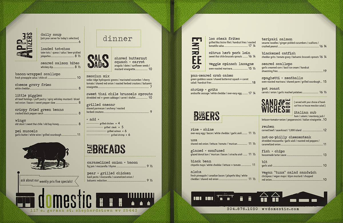
Domestic changed their menus four times a year to work with seasonal ingredients. Here are their latest menus:
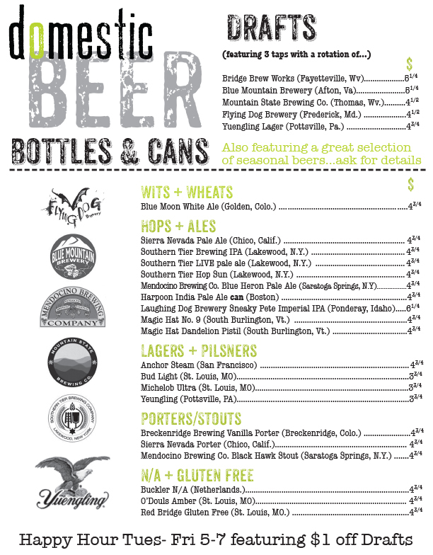
The beer menu
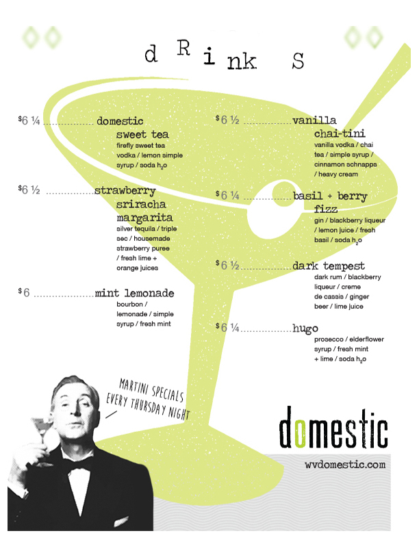
The drink menu
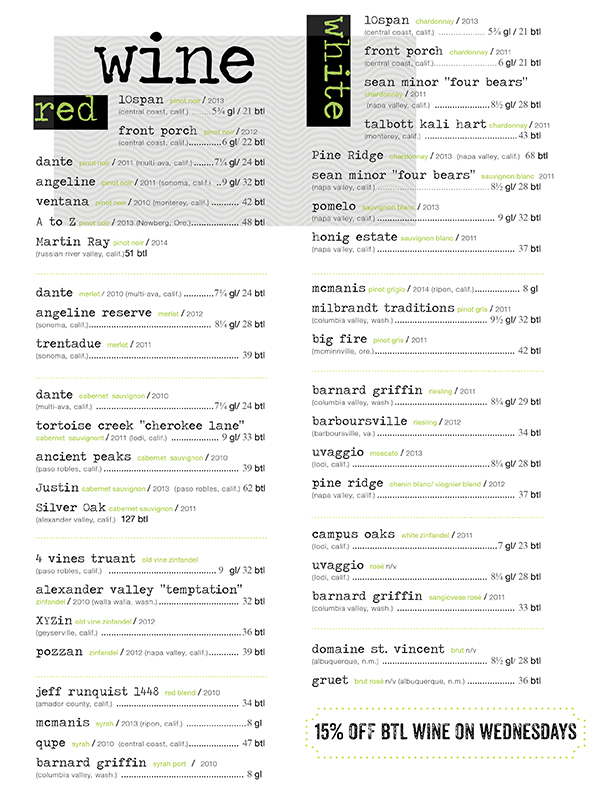
The wine list
The Website
Now that I had the printed pieces created, I began work on the website. The first site wasn't much more than a landing page and two simple 'contact' and 'about' pages. Doug was very excited to have a strong web presence. I was just beginning my education in html and css. I had very limited experience with web design, having only one semester under my belt. I had only created one functional site for my portfolio at this time. But, after a million tutorials and countless hours at the laptop, I began to piece it together. These were the early days for responsive sites that could work on any screen size. This was huge because I anticipated that a lrage segment of the clientele would be younger diners, who would primarily use their phone to interface with the site.
There were a few daunting tasks that kept me up at night. Doug had asked to have an updatable calendar for the many events that they threw on site. I needed to learn how to create a functional contact form, which menat taking a crash course on PHP. I also had to learn a little javascript to utitlize some cool features like slideshows, mobile nav and a live map. I learned how to work with Google API to customize the map in the branded colors. It took me about 3 months to finish the site because of all the learning I had to do along the way.
Check out the site:
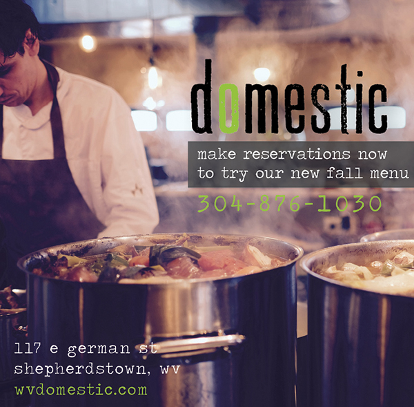
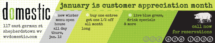
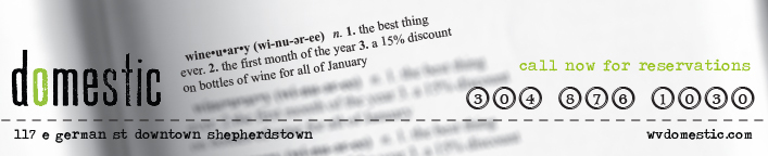
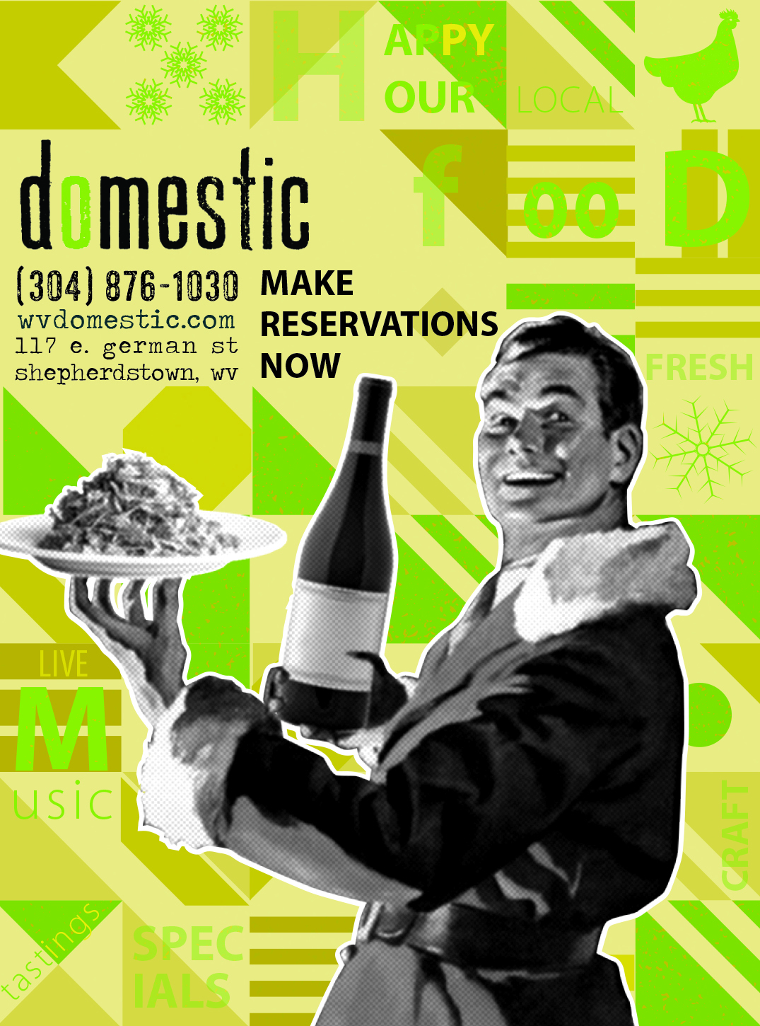
Advertising
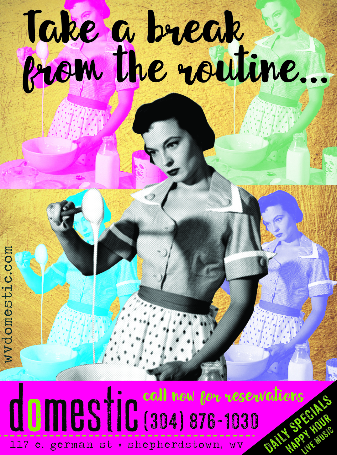
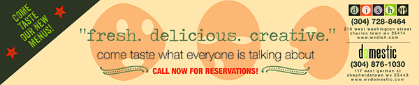
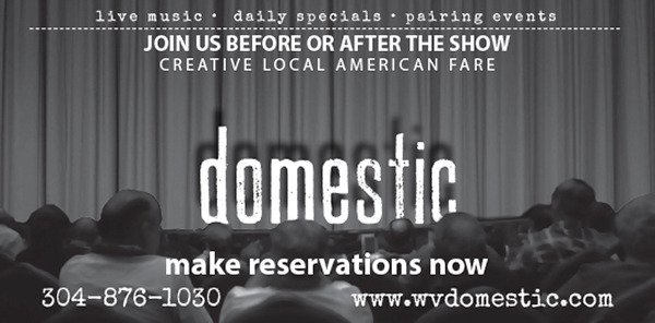
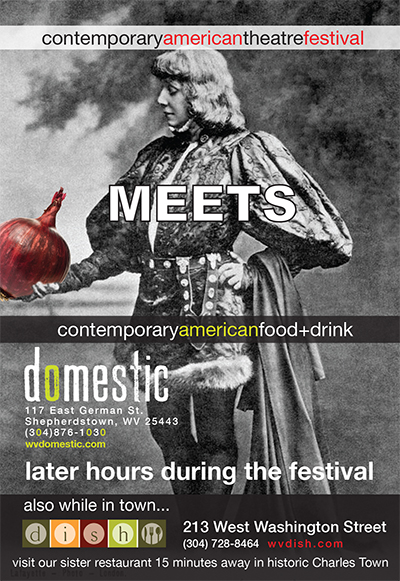
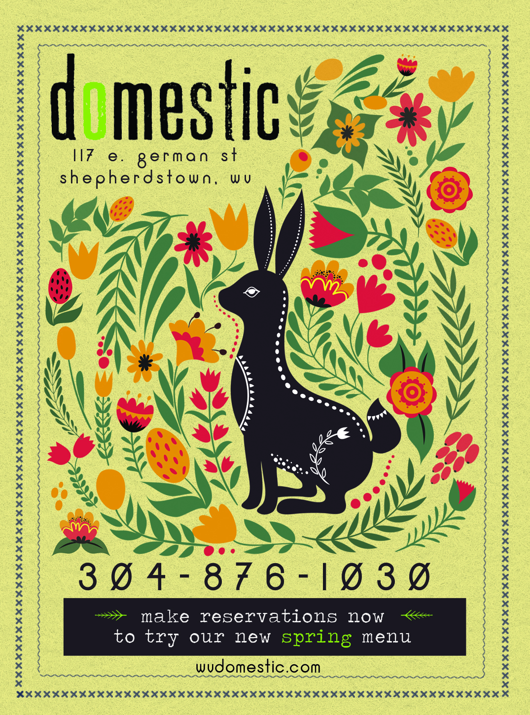
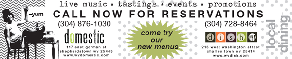
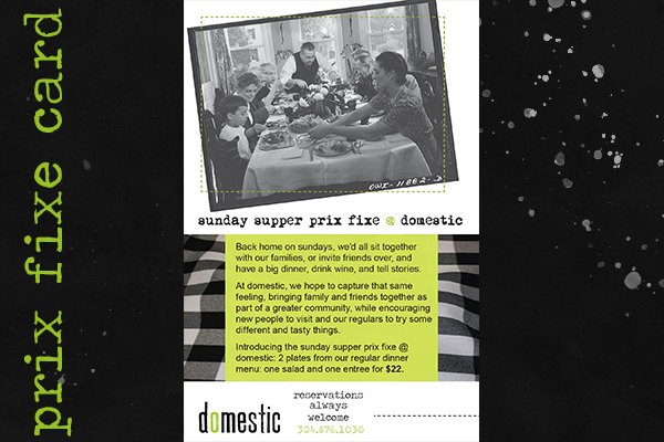
Domestic was very active with advertising in local papers and regional culinary magazines. So active, in fact, that finding a new way to say the same things every month really became a challenge, but not until the third or fourth year. I was very thankful that Doug wanted me to create new content each year rather than reusing the previous year's items. Despite challenging my creative energy, this gave me an opportunity to utilize new skills that I am constantly incorporating. SOme of the techniques would work within this brand, others were not so successful.
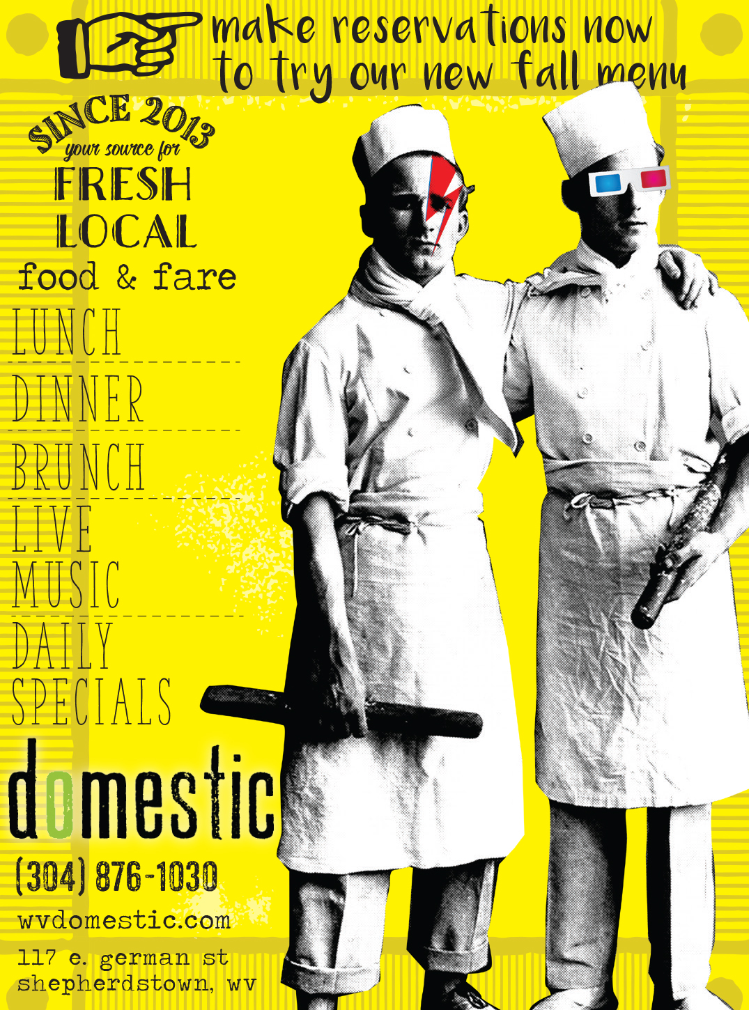
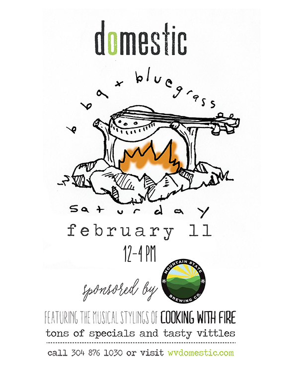
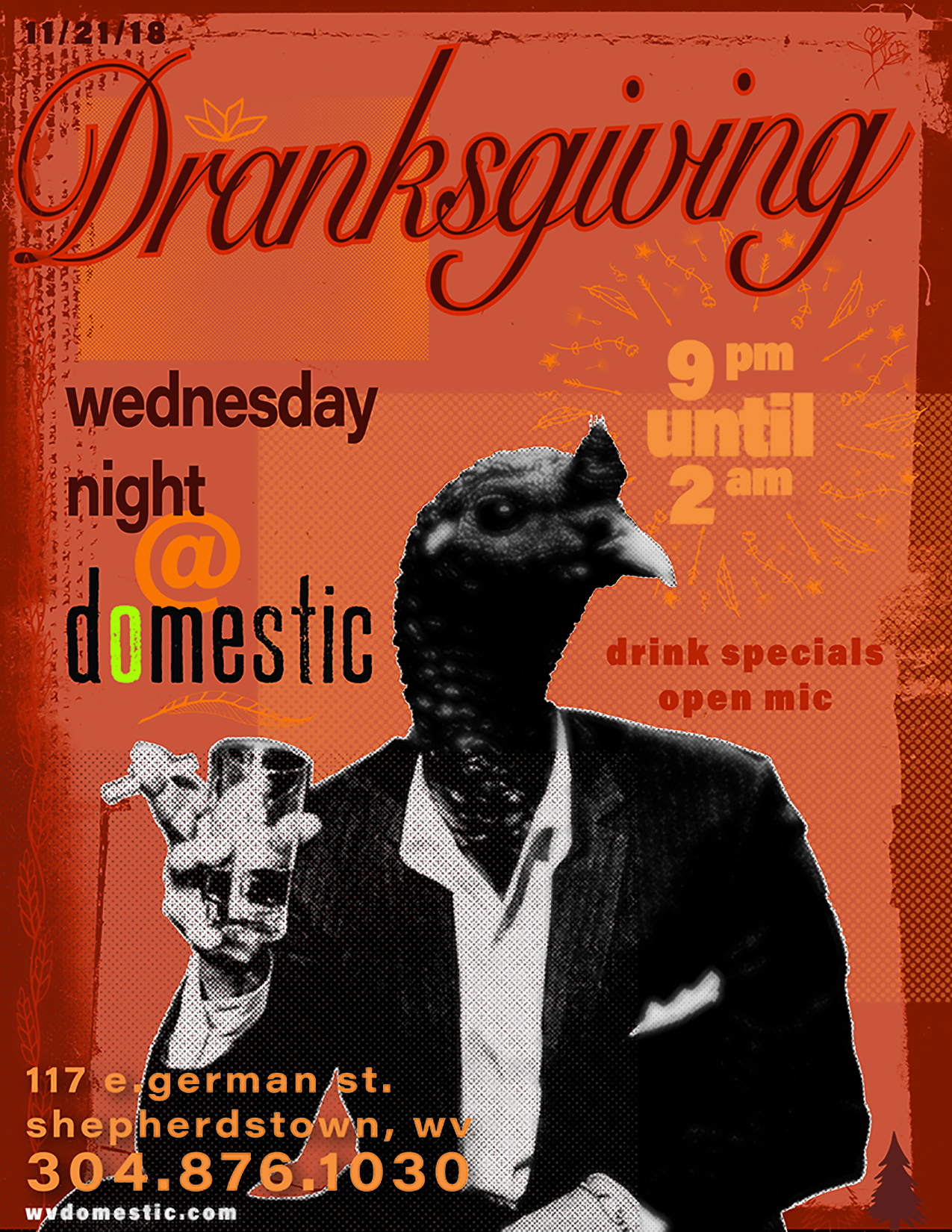
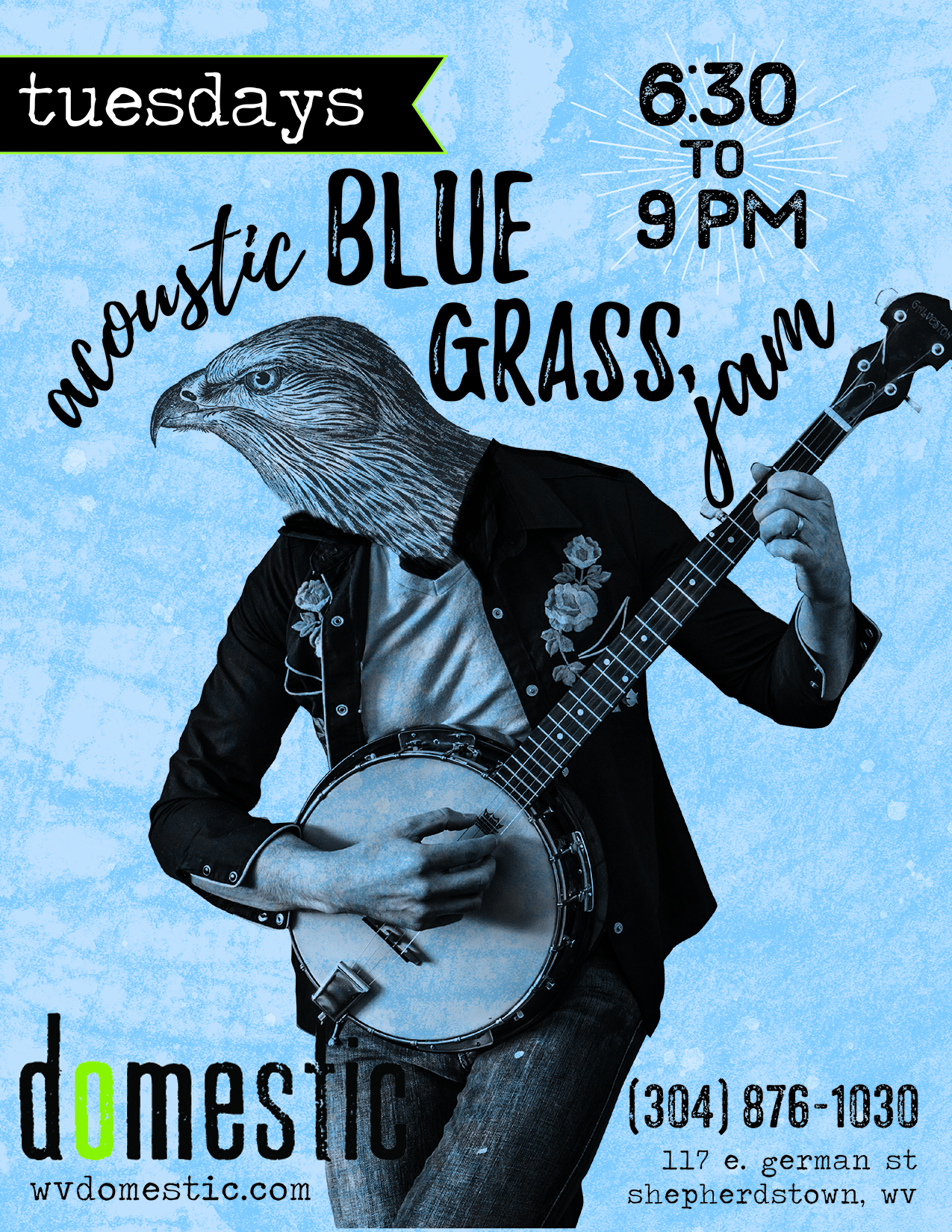
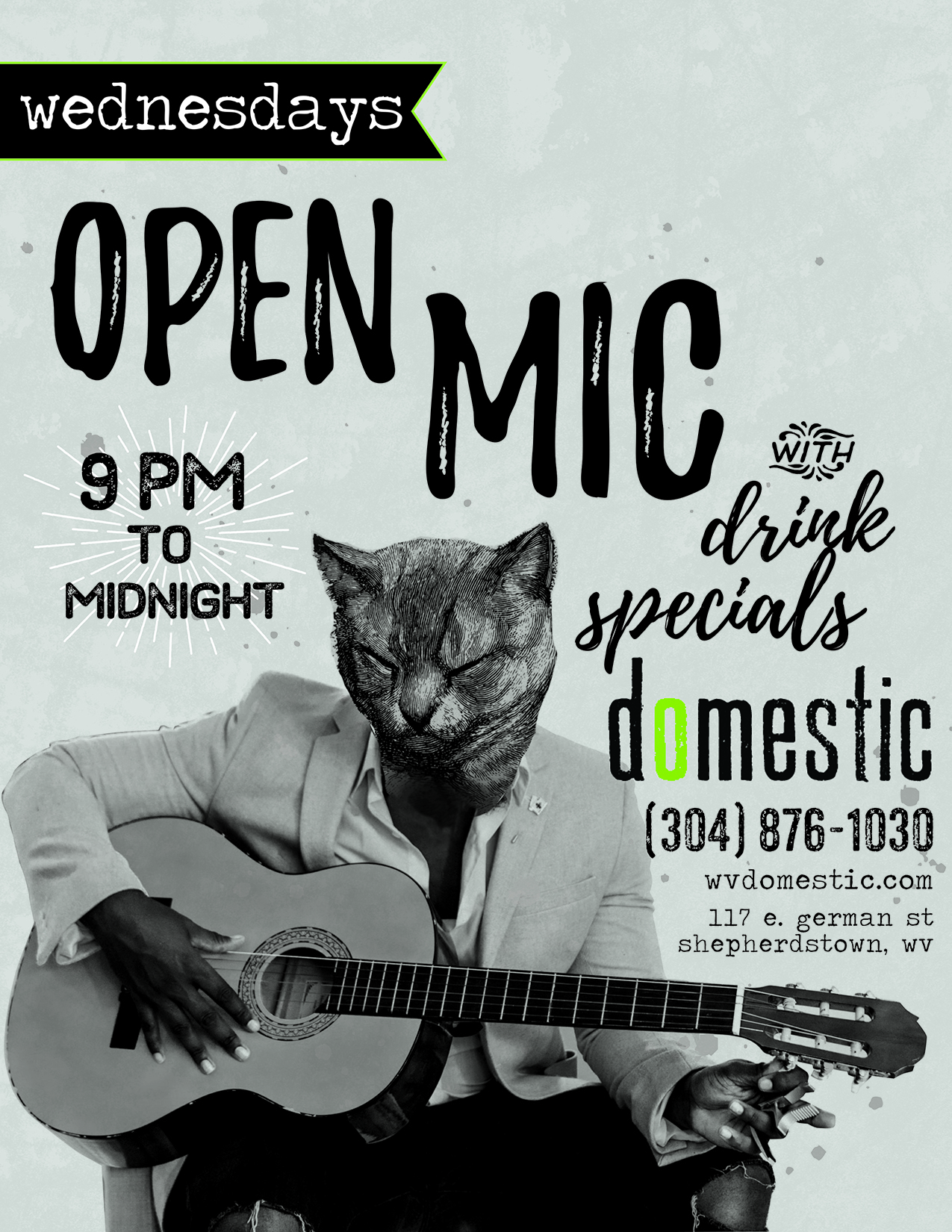
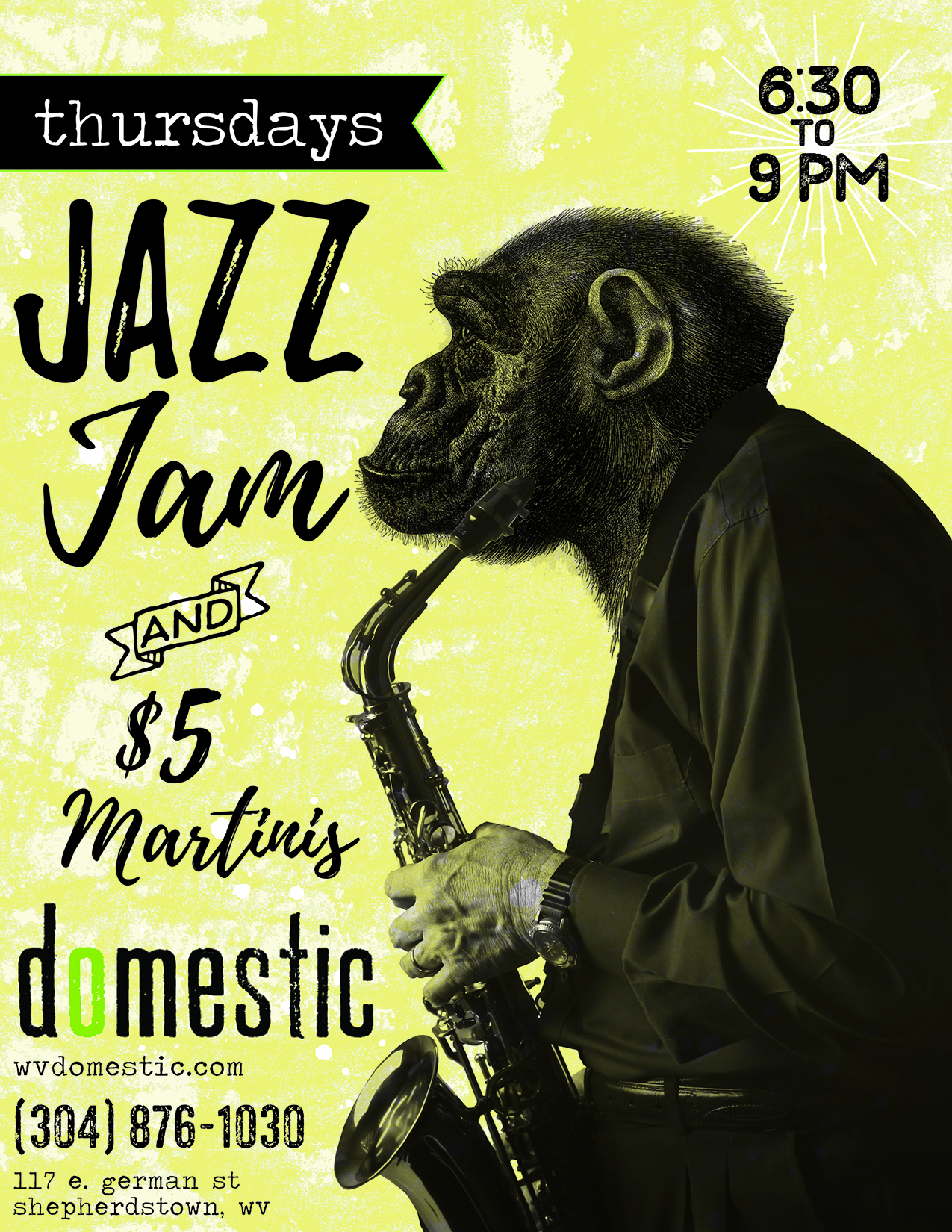
I also had developed graphic styles that were specific to this brand. One method I would use for creating graphics was sourcing vintage, public domain photography of people and dining. I would apply a half-tone effect, which would become one of the brands signatures. I was also very adventurous with the type, as evidenced in the earlier menus. I was very inspired by Terry Gilliam's work with Monty Python. Domestic hosted many artists shows and exhibits and was a staple of the local art scene. I liked the idea of vintage illustration with a modern twist, much like the concept for the food.


alt
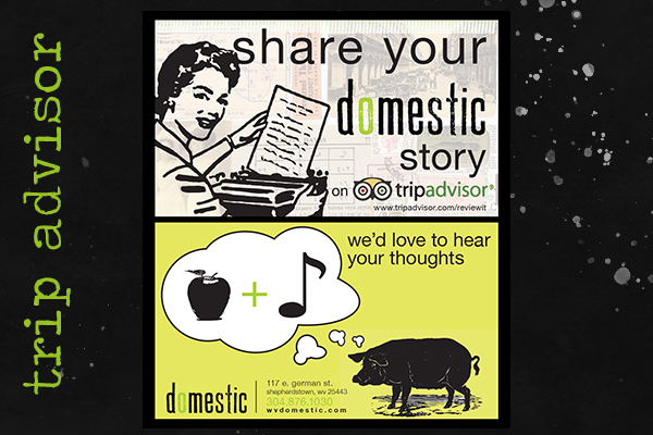
Marketing
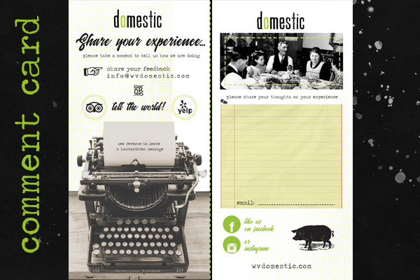
Doug was very savvy with social media and apps. I created many pieces to promote them on Tripadvisor and Yelp. There were nice centerpieces on each of the tables that held a bouquet and printed pieces for marketing. One of the pieces was to solicit people to sign up for their email club which we partnered with Constant Contact to manage. After a few tutorials, Doug was able to create and send out his own custom emails regularly. Occasionally, he would ask for a new graphic to be placed in that months mailing. We also used comment cards to gauge feedback from the guests.
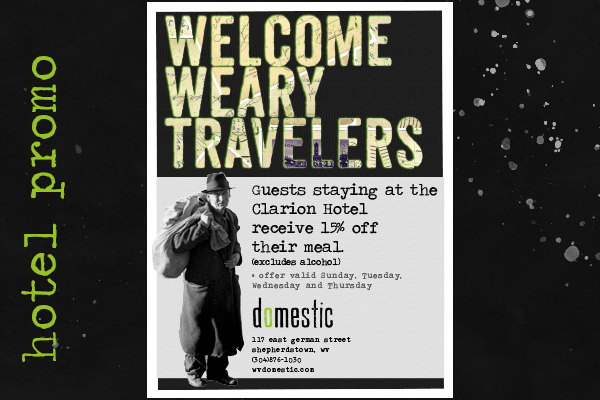
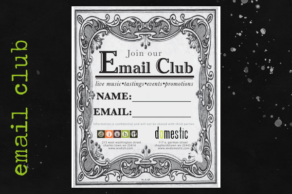
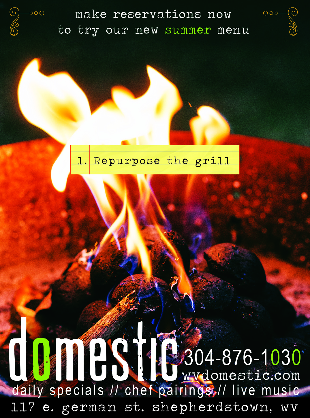
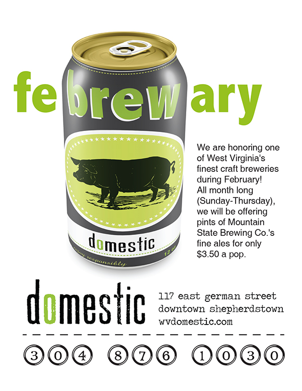
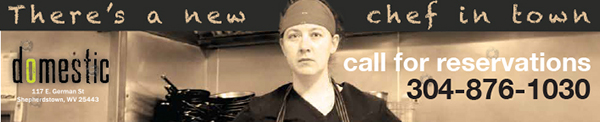
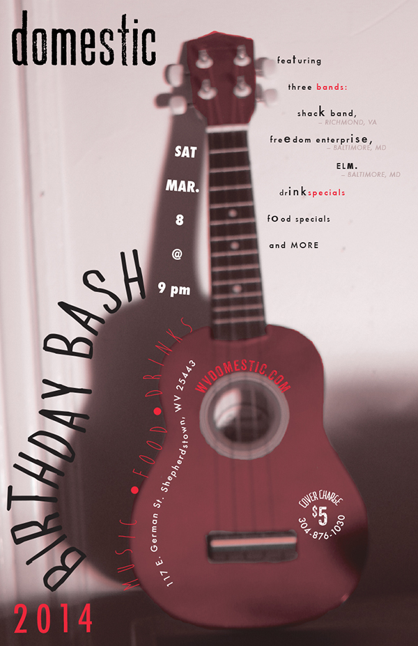
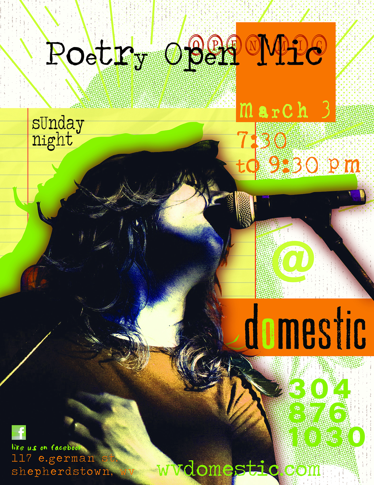
Posters/Flyers

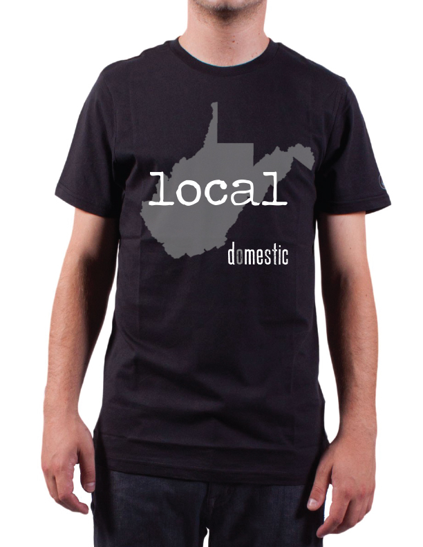
The uniform
Here's a shirt I created for the staff and for resale.
Conclusion
I hope you have enjoyed this detailed look into the Domestic identity campaign. This was the first client that allowed me creative autonomy. Doug rarely gives much direction, although that does not mean that items did not get rejected. I used this privilege to experiment with new techniques and methods, and the funkier the better, as far as Doug tastes were concerned.
Stylistically, I kept true to my design principles for the brand. The key principles that I established were edgy, modern-retro, bold and fun. I set to implement these key themes in each element that was created. I also tried to keep in mind how the different pieces would look side by side that might accompany one another.
The work contained on this page was created between 2014-2020 for Domestic restaurant in Shepherdstown, West Virginia.